The Life-Changing MAGIC of Process Behavior Charts (plus Free Google Sheets Template)

Note: I originally shared this in Ed Leake's wonderful agency community, The Forge. Also, the only reason I know about any of this was because of a post on CommonCog, which I highly recommend. Also, I got the original Sheets template here.
EDIT 1/7/2025: Since originally writing this article, the aforementioned folks at CommonCog have launched an INCREDIBLE tool that makes creating your own process behavior charts a MILLION times easier. It's called Xmrit, and it's free (in fact, you don't even need to log in!) I now use Xmrit to create all my own charts and highly recommend it.
I also did a two-part podcast with Cedric all about these charts, variation, and how understanding variation can give you a huge advantage in life. Check them out!


For several years now, I have been flummoxed by this question:
How do we separate signal from noise?
This applies to everything you do:
- How do you know one manager is better than another?
- How do you know a client is getting better or worse?
- How do you know your agency is growing or shrinking?
Clients come, clients go. Sometimes revenue is up, sometimes it's down. Sometimes leads are good, sometimes they're bad.
But...why? And what, if anything, should you do about it?
Our instinct is almost always to think "we caused this." Client results going down? Look at the account, grill the manager. Add negatives! Switch to broad match! Maybe...add TCPA? Or, take it off? Or...something???!
After all, no one likes to explain a bad week/month to a client. Best have a whole bunch of "strategic interventions" ready to go when you do, right? Show them that you're "on top of it."
Problem is, sometimes stuff just....does stuff. Numbers go up. Numbers go down. Just because stuff happened doesn't mean that you made it happen.
When I say I think about this a lot, I mean it. Hell, I wrote about this on this board 7 months ago:
"Complex Systems are dynamic.
For one, they tend to have many interacting elements, all of which share a set of dynamic, shifting interconnections. Some things affect other things, but that may change over time. The nature of the relationship can invert (from a positive correlation to a negative one, for example), or break altogether. Patterns are only ever "semi-stable" - they're there for a while, and then they fade, or expand, or intensify, or die out....
Because Complex Systems change, and show emergent and unexpected behaviors over time, accurate prediction is all but impossible, particularly over a long period. Like the weather, you will have some visibility into the future over a short period (say, the next 2-3 days)...but even then, there are no guarantees. As you try to guess the weather further out - a week, a month, a year - your likelihood of accuracy diminishes to zero."
I even shared a spreadsheet to help wrap your head around standard deviation.
And here's the thing: we all already know this.
Every single one of us has looked at an account, seen a chart with a line sloping down and to the right, and sighed - because we know we will probably have to explain this to the client, even though stuff just happens sometimes, and it probably means nothing at all.
So, we've established some important things here:
- Complex systems have variation, which means metrics move up and down purely from random chance;
- We all know this, but...
- We still have to explain these variations to clients, who usually don't like to take "shit happens" as an answer.
So - what do we do about it? Not in an ideal sense, I mean - what do we actually do about it, in real life?
You probably do what I do, which is move your cursor up to the top right on that line with the down-and-to-the-right trend line and select "90 days up till yesterday"...or 60, or 120, or whatever your favorite number is.
We do this because we all get that the best way to account for random variation is to back out and get a bigger dataset. Bigger data sets give us a trend - many data points, instead of just a few. Many data points, averaged together, reduce natural variation and give us a better sense of what's going on over time.
But there's a HUGE problem with using this method to try and improve client results, or your own business results, or any process at all really. And here it is:
If you need 90 days (or 60, or 120) worth of data before you know there's a problem, it's too late!
You can't wait 90 days before figuring out if your account interventions helped.
You can't wait 90 days before figuring out that your expenses are too high.
You can't miss out on 90 days worth of signal before trying to separate out the noise.
Not if you want to get good. Not if you want to get better. Because by the time you get around to looking at the trend, the whole system will have changed and that data will be worthless to you anyway!
We need a way of knowing what's working fast. We also need a way of separating signal and noise - of knowing when the movement of a metric is due to how freaking awesome (or terrible) we are at our job, and when it's due to nothing at all.
And I think I've found.
Ladies and gentlemen, I present to you - the TOOL that will give you the POWERS OF AN ALMIGHTY GOD, the HAMMER of RIGHTEOUS ok, it's a Google Sheet.
Here it is (make a copy so you can edit):

OK, this thing is going to change your life.
This is a Process Behavior Chart. I didn't make it up, this is a well-known tool inside the Statistical Process Control world (and I got it specifically from the excellent book Understanding Variation by Donald Wheeler - a highly recommended, short read).
Let's walk through how to use this sheet, and what it's doing.
You can use a PBC for any time series of data - so, CTR over time, leads over time, weight over time, how many butterflies you see on your way to work, whatever you like.
Column A is just the dates you want to use.
Column B is whatever metric you're tracking.
Then, we make some quick calculations:
Column C takes the average of all the data. This is referred to as X in statistical process control.
Column D takes the Moving Range - basically, the absolute difference between one measurement of the metric and the one prior.
For example, if this week's metric was 10, and last week's was 8, the Moving Range would be 2.
If this week's metric was 11, and last week's measurement was 10, the Moving Range would be 1.
Column E calculates the Moving Range Bar - basically, the average of all the moving ranges.
Column F calculates the "Lower Limit" of the metric you're measuring. We do this by calculating:
AVERAGE - (3*MR BAR/1.128)
This is a stock formula. We're dividing by a "scaling factor" that's been worked out as a part of Statistical Process Control, then subtracting what we get from average of all our metric measurements (same number that's in column c).
Column G does the same calculation, but adds it to the average to get the Upper Limit.
Finally, Column H calculates the Upper Limit of the Moving Range. The formula for this is:
MR BR * 3.27
...where 3.27 is another stock SPC scaling factor.
Now, with all these numbers calculated, we can chart them...and this is where the magic happens.
Put all of these into a line chart and you'll get something like this:
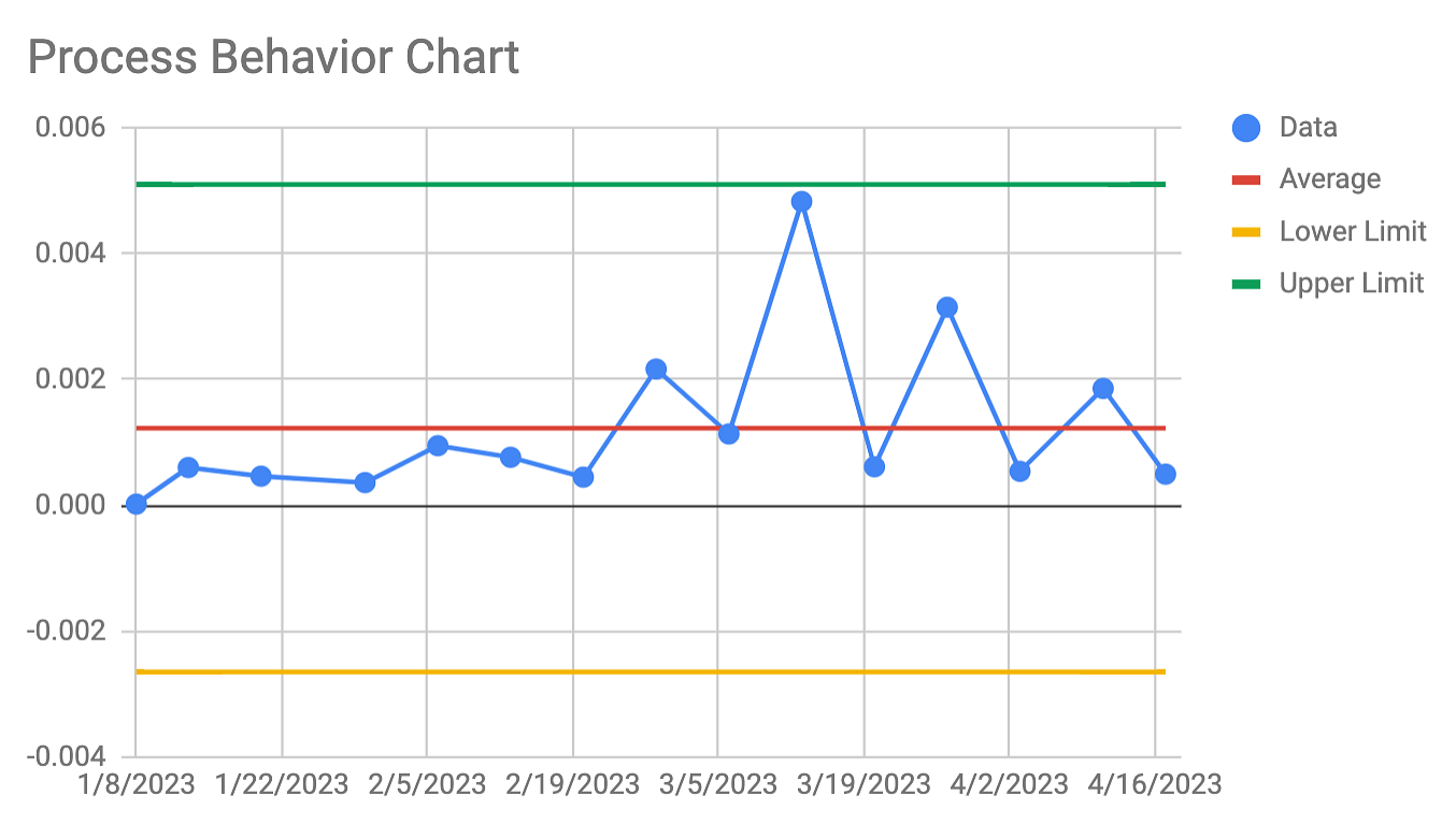
This chart is magic. I'm telling you, it's M A G I C.
Let's break down why.
The green line up top is the Upper Limit for our system (doesn't matter what we're measuring here - you can imagine it's whatever metric you care about in an account, or for your agency - leads, revenue, whatever).
The yellow line at the bottom is the Lower Limit for our system.
The red line in the middle is the Average measurement for our metric of choice.
What can you expect from the system, given the data provided?
You can expect variation around the average, within the upper and lower limit.
ANY measurement between the top and bottom lines can be considered "normal" for this system.
That big spike in the middle there? Totally normal.
That low point in January? Totally normal (and actually not that low, given what our lower limits actually are!)
Folks, this is telling you what is signal and what is noise.
ANYTHING BETWEEN THE LIMITS IS NOISE. It doesn't matter if you're up, it doesn't matter if you're down: movements between the ranges can be considered "predictable" for this system.
Now, here's the flip side:
ANYTHING MEASUREMENT THAT SURPASSES THE UPPER OR LOWER LIMIT IS SIGNAL. That means that if you go above or below your limits, you need to start looking for answers.
Just started a new campaign, and went above your upper limit? SIGNAL. You can safely attribute that change to what you did.
Added a new manager, and suddenly your client lead flow dropped below the lower limit? SIGNAL. Time to start digging into their accounts and figuring out what's up.
This chart tells you what to ignore and what to pay attention to. Not only that, it tells you FAST. You don't need 90 days worth of data to build this chart - in fact, you can start with about a week's worth of data of know immediately if something is worth looking into or not!
I cannot tell you how much this is blowing my mind.
A few words to finish off:
- There's another kind of signal to look for in these charts, and that is at least 3 of 4 consecutive data points being closer to either limit than they are to the average. If you've got 3 out of your last 4 measurements being suspiciously high or suspiciously low, even if they don't actually cross the limit line, you can take that as a sign to start looking for potential causes.
- What do you do when you start smashing through your limits, for better or for worse? This is a sign the system has changed. Just recalculate your average, MR, MR Bar, and Upper/Lower limits using your newest data set. That will give you the chart for your current system, and you can work from there.
- How do you use this to improve? That's a big question, but here's the short answer: the system will continue to produce the way it produces unless you fundamentally change it. You need to change how things work somehow, otherwise you can expect more of the same.
Happy charting. At some point I'll post this on my blog - when I do, I'd love a link or a thumbs up if you got some value out of this post.
Now, go forth with your godly powers and SMASH YOUR FOES
love,
dan
COOL STUFF TO READ:

The "Man's Divorce Memoir" just isn't really a thing. Why not?
The theory: women experience and promote a narrative of freedom and self-exploration that comes from departing from past strictures and setting a new course, while traditional gender roles and expectations render such narratives too feminine or narcissistic for men.
)

Better Questions Newsletter
Join the newsletter to receive the latest updates in your inbox.